At WhooshPro, we’ve reviewed conversion data across a wide mix of clients — ecommerce, B2B, education, hospitality, public sector. You can see a sample of the work across our portfolio. Across all of them, the widest and most consistent gap isn’t between paid and organic traffic, or between new and returning visitors. It’s between mobile and desktop on the same site, looking at the same offer, from the same brand. The same visitor converts at roughly half the rate when they land on a phone.
Most marketing teams know this gap exists in the abstract. Far fewer have actually audited why it’s happening on their own site — and almost none are treating it as the single largest revenue opportunity it usually is.
The data is more dramatic than most teams realise
A few benchmarks worth grounding the conversation on, drawn from 2025–2026 industry data:

- Mobile drives 70–78% of ecommerce traffic but converts at only 8–2.5% (Statista)
- Desktop receives 22–30% of traffic but converts at 5–4%
- Mobile cart abandonment sits at around 80%, versus 66% on desktop, according to the Baymard Institute
- A site that loads in 1 second on mobile converts at roughly 2.5x the rate of one that loads in 5 seconds (Think with Google)
- Top-decile mobile conversion sits above 5% — the rest of the field is leaving meaningful revenue uncaptured
Run the math on a typical Singapore SME doing S$100k a month in online revenue: closing even half the mobile-desktop conversion gap is often a S$20,000–S$40,000 monthly uplift with no additional ad spend. Few growth levers on a marketing dashboard come close to that — and it’s exactly the kind of compounding return that makes investing in your digital foundations so high-ROI for SMEs.
The myth: "We're responsive, so we're mobile-ready"
A few benchmarks worth grounding the conversation on, drawn from 2025–2026 industry data:

The most common blocker we encounter isn’t technical — it’s a definitional one. Teams confuse responsive design with mobile-optimised conversion. They are not the same thing.
Responsive design ensures your site looks reasonable on a smaller screen. Mobile-optimised conversion ensures it performs there: fast loads, thumb-friendly interactions, frictionless checkout, contextual trust signals, and a layout that reflects how mobile users actually behave (short sessions, one-handed use, distracted attention, cellular network variability).
Most sites are technically responsive. Almost none are genuinely mobile-optimised. That gap — between rendering acceptably and converting effectively — is where the revenue leaks out. Our piece on web design standards and best practices covers the foundational principles, and our design team spends most of its work on the layer above that: making the design actually perform.
Six patterns we find in nearly every mobile conversion audit
This is where the audit pays for itself. Across hundreds of client reviews, the same patterns appear again and again.
1. Page weight quietly murders mobile load times

Desktop visitors browse on broadband. Mobile visitors browse on a mix of WiFi, 4G, and 5G — and even in Singapore’s well-connected environment, congested networks (peak hours on the MRT, mall WiFi, hotel signals) introduce real lag. Sites loading uncompressed images, blocking fonts, and 2MB of unused JavaScript hit a wall on mobile that desktop visitors never feel.
Page speed correlates directly with Google’s Core Web Vitals, which now feed into both ranking and visible quality scores. Image weight is one of the easiest fixes to make — our older but still-accurate post on image formats: when and where to use them is a good practical starting point.
2. Forms ask for too much, too early
Desktop users tolerate longer forms; they have a keyboard and full attention. Mobile users abandon at the third or fourth field. We routinely see signup forms with 8–12 fields where 4 would do. Baymard’s checkout usability research has shown that reducing checkout fields from 16 to 7 can boost completion rates by around 20% — and the gain shows up almost entirely on mobile.
3. The CTA sits below the mobile fold and never gets seen
A hero CTA that lives 40% down a desktop screen often lives 90% down a mobile screen. Mobile visitors thumb-flick past it in under a second. Without multiple CTA touchpoints distributed through the scroll, the site’s primary action is essentially invisible to most mobile traffic. This is one of the points we explored in why modern web design is no longer about looks — visual hierarchy on mobile has to work much harder than on desktop.
4. Touch targets are too small, too close, or both
Apple’s Human Interface Guidelines recommend a 44×44 point minimum for tappable elements; Google’s Material Design recommends 48×48 dp. We routinely audit live sites where primary buttons are 28–32px, with adjacent links spaced 4px apart. The result: mistaps, frustration, and rage-click patterns.
5. Checkout adds friction at every step
Manual address entry where Google Address Lookup would auto-fill. No digital wallets enabled. No PayNow, GrabPay, or Apple Pay. Forced account creation before checkout. Each of these is a small papercut on desktop and a deal-breaker on mobile, where every keystroke is more effort. Singapore consumers in particular expect digital wallet options now — sites still requiring manual card entry are paying a real abandonment tax. If you’re running an online store, our ecommerce solutions and WooCommerce expertise focus heavily on closing exactly these mobile checkout gaps.
6. Trust signals get cut from mobile to “save space”
Reviews, security badges, payment-method logos, return-policy callouts — all the things that calm a hesitant buyer — frequently get hidden behind accordions or removed entirely from mobile layouts. On a small screen, where buyers are more uncertain, less trust information is exactly the wrong response. Visitors who interact with reviews convert at over 2x the rate of those who don’t (WordStream CRO statistics), and stripping those signals from mobile silently kills that lift.
What actually closes the gap

Insight without action is just observation. The interventions that consistently move mobile conversion in our experience:
- Performance first. Fix Core Web Vitals on mobile before anything else. Lazy-load images, defer non-critical JavaScript, and use system fonts or self-host. Without speed, every other improvement underperforms.
- Cut form fields ruthlessly. If you don’t need a field for the next decision, remove it. Use a single-step or progressive form where possible. Enable browser autofill.
- Distribute CTAs through the scroll. Sticky CTAs on long pages. Multiple buttons, not just one hero.
- Enable digital wallets. Apple Pay, Google Pay, and locally-relevant options like PayNow and GrabPay. The conversion lift on mobile checkout is consistent and measurable.
- Increase touch target sizes. 44px minimum, with adequate spacing between adjacent tap zones.
- Keep trust signals visible on mobile. Reviews, security badges, return policies — show them, don’t hide them.
- Track mobile and desktop conversion separately in GA4. Blended numbers hide the problem.
For most teams, this isn’t one project — it’s a cluster of smaller fixes done in priority order. Our web solutions team typically sequences them around the highest-leverage wins first.
Three takeaways for marketing teams
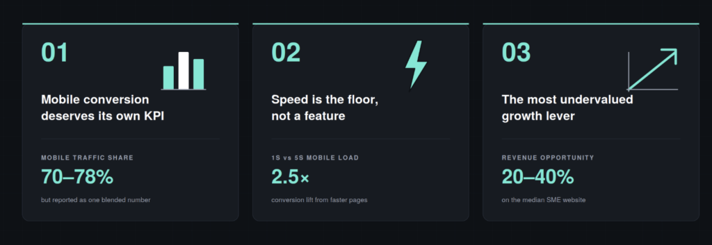
1. Mobile conversion deserves its own KPI
Reporting a single blended conversion rate to leadership is misleading. The mobile-desktop gap is almost always the largest CRO opportunity on the dashboard, and you can’t act on what you don’t measure separately. Add device-segmented conversion to your monthly reporting, today. If you haven’t worked through GA4 properly yet, our digital marketing primer is a useful refresher.
2. Speed is the floor, not a feature
Every other improvement — better forms, smarter CTAs, richer trust signals — depends on the page actually being fast enough for the visitor to engage with it. Performance work isn’t glamorous, but it’s the highest-ROI mobile intervention almost every site can make. Our piece on why modern web design is no longer about looks covers why this matters more than design polish, and the level up your business with a UX-friendly website post extends the argument into broader UX terms.
3. The mobile gap is usually a 20–40% revenue opportunity
We say this carefully because it varies by industry, but on the median client, closing half the mobile-desktop conversion gap is worth more than any single paid campaign optimisation we’ve seen. It is, in our experience, the most consistently undervalued growth lever on a typical SME website.
Mobile drives the visitors. Desktop drives the dashboard. That mismatch is not a “nice-to-improve” optimisation — it’s the largest invisible cost on most websites today. The teams that recognise it as such, instrument it properly, and treat it as a discrete project tend to see the biggest conversion gains of any work they do this year.
At WhooshPro, we design and build digital experiences that perform on the device most of their visitors actually use. Whether you’re working on a WordPress site, an ecommerce store, or a custom web build, our services are designed around what actually moves conversion. Visit us at whooshpro.com or reach out at whooshpro.com/contact for a fresh pair of eyes on your mobile conversion data.