
Last Updated: 8 September 2026
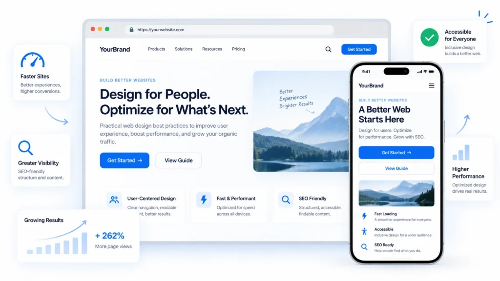
Web design best practices help create websites that are easy to use, accessible and built to perform. From clear navigation and responsive layouts to page speed and strong calls to action, these principles can improve both the user experience and how effectively your website supports your business goals.
While there is no single set of web design standards that works for every website, these 10 best practices provide a practical foundation for designing a better online experience.
1. Design with clear visual hierarchy and readable typography
A clear visual hierarchy helps users understand what is important and where to look next. Headings, body text, buttons and supporting information should each have a distinct level of emphasis, making the page easier to scan and understand.
Typography plays an important role too. Choose fonts that are easy to read across different screen sizes, and use size, weight and spacing consistently to separate headings from body content. For body text, 16px is a common starting point, although the ideal size will depend on the typeface and device.
Avoid using too many fonts or styles, as this can make a website feel cluttered and inconsistent. Instead, use a limited type system and create variation through font size, weight and spacing.
Good contrast between text and its background is equally important. Content should remain easy to read without users having to strain or rely on colour alone to understand what is important.
2. Make information easy to find
Users should be able to find what they need without having to click through multiple pages or guess where information is located. Keep navigation clear, use familiar labels and group related content logically so visitors can understand the structure of your website at a glance.
For websites with a larger amount of content, site search can provide another useful way for users to find information quickly. Traditional search often depends on exact keywords, while semantic search can better understand the meaning behind a query and surface related content.
Tools such as Breezy AI Search can help visitors search existing website content using natural language and receive relevant results or answers, reducing the need to manually browse through multiple pages.
Whether users navigate through menus or search directly, the goal is the same: help them reach the right information with as little friction as possible.
3. Design around your users' goals
A good website should be structured around what users are trying to achieve, rather than simply presenting information in the order the business wants to share it.
Start by identifying the main actions visitors are likely to take, such as learning about a service, comparing options, contacting the business or completing a purchase. Important content and actions should be easy to find and given greater visual priority.
Keep each page focused on a clear purpose, break longer content into easy-to-scan sections, and remove unnecessary steps that may slow users down.
When the website structure matches users’ needs, visitors can move through the experience more confidently and are more likely to complete the intended action.
4. Make your website accessible
Accessibility should be considered from the start of the design process so that more people can use your website comfortably, including users with visual, motor, hearing or cognitive needs.
Use sufficient colour contrast, clear heading structures and descriptive link text. Forms should have visible labels, interactive elements should be usable with a keyboard, and focus states should be easy to see.
Avoid relying on colour alone to communicate meaning, and add useful alternative text to important images so screen reader users can understand their purpose.
Following recognised accessibility guidelines, such as WCAG, can help create a more inclusive experience while also improving usability for everyone.
5. Use colour and whitespace purposefully
Colour should support the user experience, not compete with it. Use a consistent colour palette to reinforce your brand, guide attention and help users understand which elements are interactive or important.
Avoid using too many colours across the same page, as this can make the interface feel cluttered and reduce visual hierarchy. Instead, reserve stronger colours for key actions, highlights or important information.
Whitespace is just as important. Giving content enough room helps users separate sections, scan information more easily and focus on what matters.
Good use of colour and spacing can make a website feel clearer, more polished and easier to navigate without adding more visual elements.
6. Make calls to action clear
Calls to action should make the next step obvious. Instead of using vague labels such as “Click here”, “Submit” or “Learn more”, use descriptive wording that tells users what will happen after they click.
For example, “View our web design services”, “Request a consultation” or “Download the guide” gives users more context and helps them decide whether the action is relevant to them.
Placement matters too. Primary CTAs should appear where users are most likely to need them, such as after explaining a service, presenting a benefit or answering a common question. On longer pages, it can also be useful to repeat an important CTA at natural decision points instead of relying on a single button at the top or bottom.
Visually, important actions should be easy to recognise through contrast, size, spacing and consistent button styling. However, avoid making every action look equally prominent. A clear distinction between primary and secondary CTAs helps users understand which action is most important.
It is also worth considering the wording from an accessibility and usability perspective. Link and button labels should make sense even when read on their own. For instance, “View pricing” is clearer than “Click here” because users immediately understand the destination.
Finally, avoid overwhelming visitors with too many competing actions. A focused page with one clear primary goal will usually make it easier for users to decide what to do next.
7. Design for mobile and different screen sizes
People access websites across a wide range of devices, from smartphones and tablets to laptops and desktop monitors. A responsive web design should adapt its layout, content and interactions so that the experience remains clear and usable at different screen sizes.
This goes beyond simply resizing the page. Navigation, buttons, forms, images and text should all be designed to work comfortably on smaller screens, with enough spacing for touch interactions and no need for unnecessary zooming or horizontal scrolling.
Mobile usability is especially important, with mobile accounting for roughly half of worldwide web traffic in August 2026.
A well-designed responsive experience helps users complete the same key tasks regardless of the device they are using, while poor responsive behaviour can lead to broken layouts, difficult navigation and missed conversions.
8. Use visuals to support your content
Visuals can make a website easier to scan and help users understand information more quickly. Images, illustrations, diagrams and videos can break up long sections of text, highlight important messages and draw attention to key actions.
However, visuals should support the content rather than replace important information. Essential details should still be available as text so they remain accessible, searchable and easy to understand across different devices.
Choose images that are relevant to your brand and the purpose of the page. Decorative visuals can be useful when they strengthen the overall experience, but too many unnecessary images may create clutter and increase page load time.
It is also important to consider how visuals behave across different screen sizes. Images should resize or crop appropriately on mobile devices without hiding important content or making the page difficult to navigate.
Where appropriate, add descriptive alternative text to meaningful images so users relying on screen readers can understand their purpose.
Finally, optimise image file sizes and formats before publishing them. High-quality visuals should enhance the experience without slowing down the website, which leads to the next best practice: website speed and performance.
9. Optimise website speed and performance
Having all the above points we mentioned counts for nothing if visitors to the site don’t stay long enough to see it. Studies show that visitors to a site form their first impressions of a site within 50 milliseconds and a slow loading speed would only give users a bad first impression.
Of course, certain things are out of your control such as traffic and web hosting server but one thing you can do is observe file sizes. Choosing the right image file format can go a long way in optimising page loading speeds. You can read more about how to do so here.
Slow loading speeds can also negatively affect your site’s Search Engine Optimisation.
10. Build SEO into your web design
Another core component of websites, SEO will heavily affect how much traffic your receives.
Choosing the right header tags, proper meta descriptions and having relevant keywords can go a long way in improving your ranking on search engine result pages .
View our guide on SEO for a more detailed explanation.
Conclusion
How your website is designed will ultimately impact whether or not your site is successful. While there isn’t a one-size-fits-all solution, what matters most is that you continue to work on optimizing your website for your target audience.
And if you’re interested in building a site for your business, contact us today to speak with our web developers.