
You’ve spent time perfecting your website’s colours, typography and visuals. Everything looks polished. But when visitors land on your homepage, do they actually understand what your business offers?
That’s where your website hero section design makes a difference.
As one of the first elements visitors encounter, your hero section helps shape their initial impression. It should communicate your message, capture attention and guide visitors towards their next step.
However, even a visually impressive hero section can fall short when creativity gets in the way of clarity. As we explored in our article on why modern web design is no longer just about looks, effective design should balance aesthetics with usability.
Here are five common mistakes to avoid.
What Is a Website Hero Section?
A website hero section is the prominent area at the top of a webpage, usually appearing just below the navigation menu. It’s often where visitors get their first impression of your brand and decide whether to explore further.
A typical hero section brings together a headline, supporting text, visuals and a call-to-action (CTA) button. While these elements may seem straightforward, how they’re designed and presented can influence how easily visitors understand your message.
Think of it as the opening introduction to your website. A well-designed hero section should quickly communicate what your business does, highlight its value and give visitors a clear direction.
Whether you’re creating a corporate website, an e-commerce store or a campaign landing page, effective hero section design balances visual appeal with clear communication and usability.
1. Using Headlines That Sound Impressive but Say Nothing
“Innovating Tomorrow.”
“Your Future Starts Here.”
These headlines sound creative, but what do they actually communicate?
One common mistake in homepage hero design is prioritising clever wording over clarity. When visitors cannot immediately identify your offering, they may leave without exploring further.
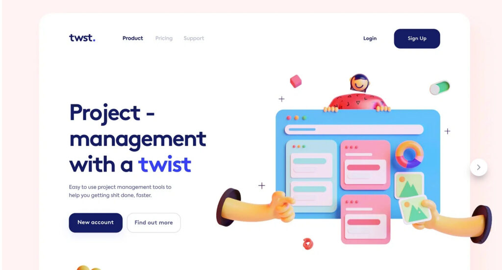
Reference from: https://dribbble.com/shots/13933144-Project-Management-Landing-VisualExploration
How to fix it:
Write a headline that communicates what your business does or the value it provides.
Before: “Transforming Your Digital Future”
After: “Custom Website Design That Brings Your Brand to Life”
The second headline provides more context without sacrificing creativity.
A good headline should spark interest, not leave visitors guessing.
2. Overloading Your Hero Section With Too Much Information
Your business offers multiple services, promotions and solutions. Naturally, you want visitors to know about all of them.
But squeezing everything into your hero section can create visual clutter.
When headlines, images, promotional badges and multiple CTA buttons compete for attention, visitors may struggle to identify what’s important or where to click next.
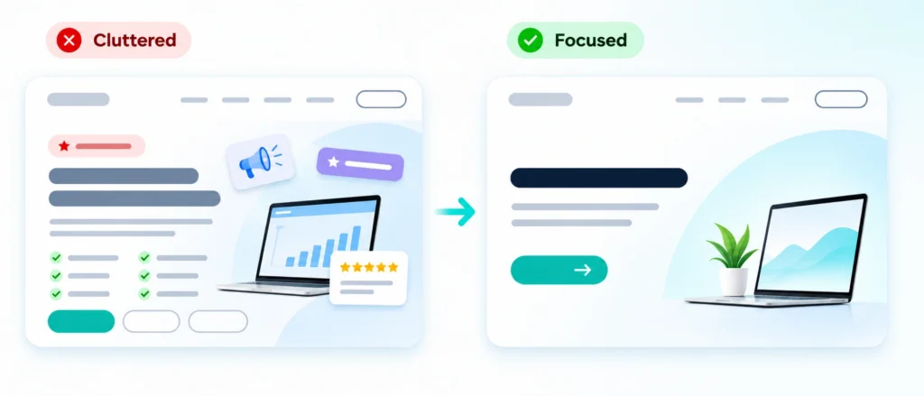
How to fix it:
Establish a clear visual hierarchy:
Headline: Communicate your primary message.
Supporting text: Explain the value or benefit.
Primary CTA: Guide visitors towards one main action.
Visuals: Reinforce your message without distracting from it.
Use sufficient white space, consistent typography and thoughtful spacing to guide visitors through the content.
Your CTA should also be specific. Instead of using a generic “Click Here” button, consider action-oriented labels such as “View Our Work” or “Explore Our Services”.
These principles extend beyond the hero section. Explore our 10 web design best practices for more ways to improve your website’s user experience.
Remember, your hero section doesn’t need to tell your entire story.
3. Choosing Beautiful Visuals That Don't Support Your Message
A stunning 3D illustration, cinematic background video or abstract graphic can make your website stand out.
But does it help visitors understand your business?
Visuals should do more than fill empty space. When imagery feels disconnected from your services, it can create confusion instead of strengthening your message.
Even well-chosen images can become distracting when important text is difficult to read against them.
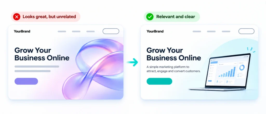
How to fix it:
Choose imagery that supports your content and audience.
For example, a software company could showcase its product interface, while a creative agency might highlight selected design projects.
Pay attention to readability, too. Use sufficient text contrast and consider subtle gradient overlays when placing headlines over photographs.
According to the Web Content Accessibility Guidelines (WCAG), Level AA requires a minimum contrast ratio of 4.5:1 for normal text and 3:1 for large text, with specified exceptions.
The goal isn’t to remove creativity. It’s to ensure every visual serves a purpose.
4. Designing for Desktop but Forgetting Mobile
Your homepage might look impressive on a desktop screen, but what happens on a smartphone?
Large headlines may wrap awkwardly, important visuals might get cropped and CTA buttons could become difficult to access.
Simply shrinking a desktop layout doesn’t guarantee a good mobile experience.
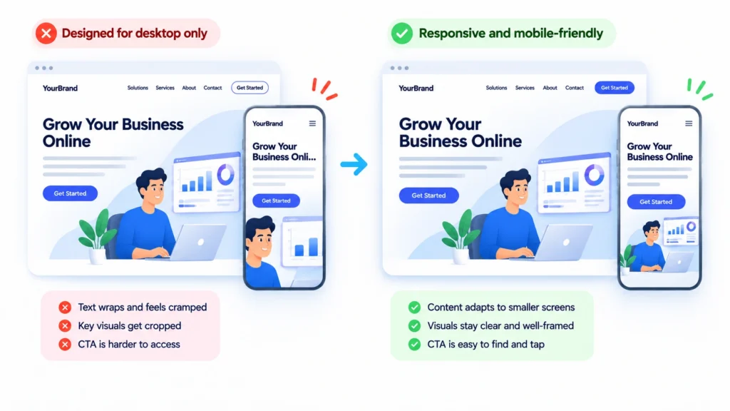
How to fix it:
Design your hero section with responsive behaviour in mind.
Consider adjusting typography, rearranging content and using different image crops for smaller screens.
Check that important messages remain visible and CTA buttons are comfortable to tap.
Mobile usability also plays a role in helping visitors take action. Learn more in our article on why mobile conversion rates can be lower than desktop.
A strong mobile hero design should provide an equally clear experience, even if it looks different from its desktop version.
5. Using Heavy Images and Animations That Slow Down Your Website
Your homepage might look impressive on a desktop screen, but what happens on a smartphone?
Large headlines may wrap awkwardly, important visuals might get cropped and CTA buttons could become difficult to access.
Simply shrinking a desktop layout doesn’t guarantee a good mobile experience.
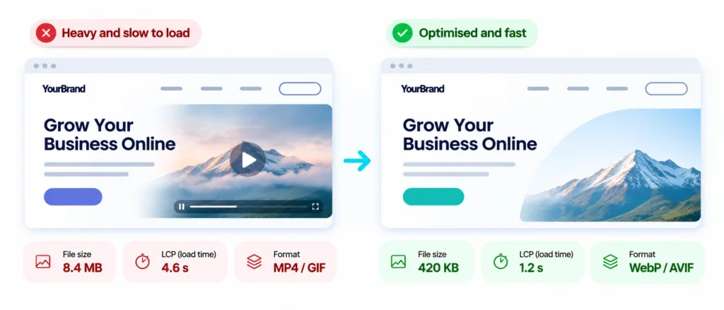
How to fix it:
Optimise images using suitable formats such as WebP or AVIF, deliver appropriately sized assets and avoid unnecessary animations.
If your hero image is the LCP element, prioritise its loading rather than applying lazy loading, as explained in Google’s LCP optimisation guide.
Not sure which image format to use? Read our guide to image formats and when to use them.
You can also check your website’s performance using Google PageSpeed Insights.
Remember, animations should enhance the user experience, not delay it.
Quick Checklist: Is Your Hero Section Working?
Before launching your website, ask yourself:
Can visitors quickly understand what your business offers?
Is your headline clear and readable?
Do your visuals support your message?
Is there an obvious next step?
Does the design work well on mobile?
Are your images and animations optimised?
If you’re unsure, ask someone unfamiliar with your business to review your homepage. Their feedback can reveal issues you might have overlooked.
Final Thoughts: Great Hero Design Goes Beyond Aesthetics
A well-designed hero section is more than an attractive banner.
It brings together clear messaging, purposeful visuals and thoughtful user experience to help visitors understand your business and explore further.
Creativity makes your website memorable. Clarity makes it usable. The strongest designs achieve both.
At WhooshPro, we believe effective web design should balance visual creativity with functionality. From conceptualisation to responsive website development, we help businesses create digital experiences that reflect their brand and engage their audience.
Looking to improve your website’s first impression? Explore WhooshPro’s web design services and discover how thoughtful design can bring your brand to life.