You might have heard the term ‘Infographics’ being thrown around a fair it but what are they exactly? Here’s some explanation of what they are.
What is an infographic?
First, let’s start with the definition of the word itself.
According to Dictionary.com, an infographic is “a visual presentation of information in the form of a chart, graph, or other image accompanied by minimal text, intended to give an easily understood overview, often of a complex subject”.
Basically, an infographic aims to increase comprehension of a subject by breaking down information and presenting it in easily digestible portions, through the use of images.
What makes a good infographic?
Infographics make complex topics simpler to understand. By utilising graphics to break down and display information, the information or message becomes clearer compared to information received in an auditory/text-based format.

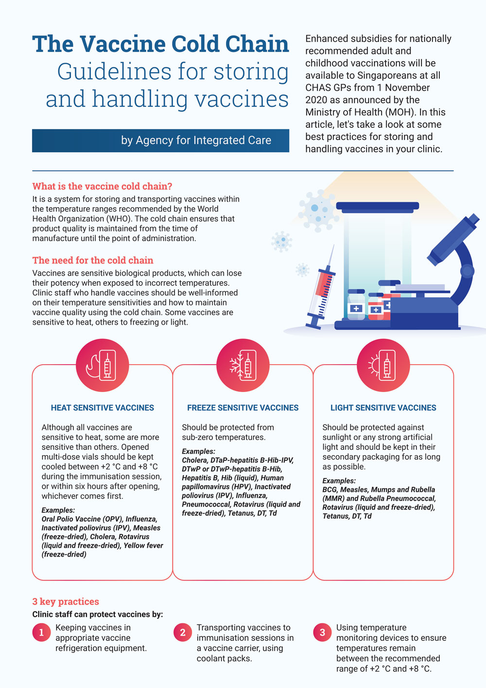
Take this infographic that we designed for Agency for Integrated Care for example.
Readers are guided by visual elements which tell them the key information quickly. Through the main title at the top of the page which is highlighted by having a larger font, readers instantly know the subject of the infographic. That is complemented by the main artwork located at the centre of the infographic, making it unmissable to even the most casual glances.
Icons also serve a similar function to the main artwork, working in conjunction with the Sub-headers highlighted using different colours, font-size and capitalised to set them apart from the main body text in an obvious way. This allows readers to know what the information that particular section contains without having to read an entire chunk of text.
This is especially useful when there is a lot of information to absorb. Users might not have the time nor patience to sit down and read entire paragraphs of text. Having these section segment guides, allow for the highlighting of certain important information. Giving the readers freedom to choose the information that is relevant to them.
Having such visual segmentation and guides also help to make the content seem easier to digest and thus help keep readers interested as well as increase retention of the information. This is especially true when it comes to using cases such as digital marketing content where every second of view time counts.
Conclusion
Essentially, Infographics are a useful way for breaking down information as well as catching and maintaining the attention of readers.
A balanced mix of visual elements to streamline the presentation of the information is vital to accomplish the latter especially when the infographics are part of a marketing campaign.
If you’re interested to find out more about email marketing tools you can use to send out your infographics, check out our FAQ on the topic here.


