Updated on 24 Aug 2026
What is a web safe area?
Ever designed a website banner that looks perfect on desktop, only to find the headline or button cropped on mobile? This is where a website safe area comes in.
A website safe area is the part of a layout where important content such as headlines, buttons and key visuals can remain visible across different screen sizes and aspect ratios. While there is no single universal safe-zone size, designing with responsive layouts and sensible content placement helps prevent important elements from being cropped, hidden or obstructed.
It’s a concept that helps design adapt and respond to different devices and screen sizes.
By keeping the most important content within the web safe zone, designers and developers can help ensure that users can access key information across different devices. It also reduces the risk of important content being cropped, hidden or difficult to access.
How can you determine the safe zone for web display?
Unfortunately, there are no way getting around it as web safe zones aren’t one-size-fits-all. The dimensions of the zone vary based on your web design and devices used. Therefore, it’s important to consider these factors and adjust your design accordingly for the best user experience.
A general guideline is to keep important content, such as headlines and calls-to-action, within the viewable pixels of the page (across various devices screen form factors), and to avoid placing critical content in areas that require scrolling horizontally or vertically (which may be cut off).
Tips to create your web responsive banner to fit into your display safe zone
When designing your web banner, it is important to consider that the most important information are visible in all devices.
These could be headlines or important graphics which might be lost in different devices.
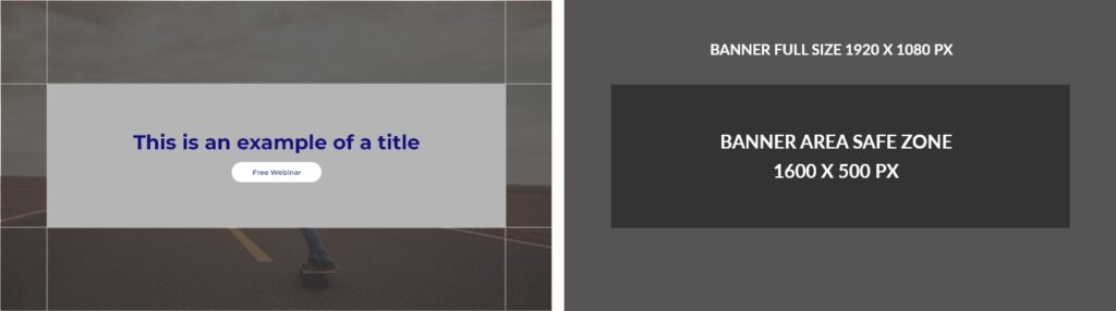
An example on how a web safe zone should look like (key context, the title, and the button, will fall within the Safe Zone to be visible on various devices screen form factors – minimizing cut off)
Do’s
- Layout is responsive and adaptable to different screen size and devices
- Essential with graphic and button within the display safe zone
Dont’s
- Content & graphic will be cut off if it appears in different devices
- Headline / Button is cropped
In summary, creating a responsive web banner with accessible content involves a process of experimentation and refinement. Through trial and error, we achieve an engaging user experience that connects with our audience with highly visible content.
If you think this article has helped you, how about try reading our other articles that might be related such as how you can optimize image for seo.
And if you need professional web design services, feel free to get in touch with us.