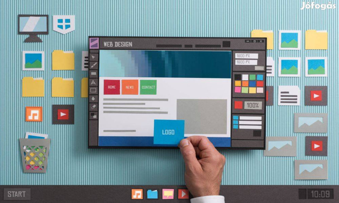
Just having a website is no longer enough these days.
As the digital forefront of your business, your website is where visitors find your business, pick up important information, and take steps towards becoming customers. The first impression on your target audience can easily make or break your business — and how your website is designed plays a crucial role in whether that impression is a positive one.
Here are 10 good web design practices for you to set yourself apart from your competitors.
1. Readable Fonts
Text makes up a big chunk of your website, from navigation to messages that you are trying to get across. As such, readability is an extremely important point to keep in mind. No one wants to stay a website with hard to read fonts.
Font size is the first and easiest thing to adjust for readability. Don’t be the website that has texts for ants.
If visitors have to squint just to make out what your content, they probably won’t stick around. The general rule of thumb is to keep font sizes for body texts to around 16 pixels or so but that may change depending on the screen size of your users and on your content.
Color affects readability of the font significantly. One nice font color may work well on its own but with a certain background color it can be an entirely different story.
Take into consideration your brand and what kinds of font would work well with it. Think about what you want your customers to associate your brand with.
Avoid using too many fonts, it can cause your site to look messy and disorganised. Keep it to 2-3 fonts and if you need variation, what you can do is play around with the font weights and sizes.
2. Have a simple navigation
Having a complex navigation system only creates confusion amongst your audience. You want to let your users reach what they want to find in as little clicks as possible.
Approach it from the perspective of your audience. Is the information you want to share easy to get to? If your navigation is difficult to use, your users won’t stick around.
Stick to design elements that are already understood by users like the hamburger icon. You don’t have to fix something that isn’t broken.
3. Organised content
Arranging and organising content in a coherent way can make or break a site.
A disorganised and messy site would turn people away simply due to the dysfunctionality and difficulty in finding what they seek. It can also give off a bad impression of the company being unprofessional.
One way to organise the content would be to employ a grid-based layout, keeping it aesthetically clean and functionally smooth.
4. Include email marketing and social media links
Visitors to your site might not always hang around on your site. Therefore it’s important to create a point of contact to maintain the brand presence within your visitor’s lives.
Email marketing and social media are two different ways to accomplish this. Depending on your brand and target audience, you might choose one or the other or even both.
Email marketing can provide a personalised form of connection with visitors while social media can allow for better brand recognition via sharing by visitors.
It is advisable to place these at the bottom of your webpage as users tend to come a decision whether they want to maintain contact after seeing your products/services. It is also because social media links are primarily outbound and this can cause you traffic if it were placed before the end of your website.
5. Strategic color schemes
Colors help set the tone for your website and brand as a whole. A suitable color scheme can give off a professional look and feel, creating trust with your customers.
Having no color can also be used as a design element. White space gives breathing space between content preventing information overload for your visitors. It can also be used to separate different sections and guide the flow of content.
Another thing you might want to consider is accessibility for color-blind users. It’s not do or die, but it’s definitely a great feature to have.
Color contrast can also bring attention to specific areas of your site like call to action buttons, which brings us to our next point.
6. Call to action buttons
A strong and obvious call to action button can be the difference between users purchasing your product or engaging your services. You want to highlight your call to action buttons and make it accessible for your visitors.
The text you use also plays a part in convincing users to make the jump. A clear and direct call to action in line with the rest of your messaging and the interests of the target audience.
One common mistake is only having call to action buttons on certain pages like the homepage or the product pages. Users aren’t going to navigate to another page just to click on a button and that can mean the difference between gaining a new customer or just another visitor.
7. Responsive design
Having a good responsive design is a vital part to any website. Users will be accessing your website using different screen sizes, from mobile devices to tablets to PCs. This is especially prevalent given that more and more people are accessing websites using their mobile devices.
Even within same platforms, there are different screen sizes and having a good responsive design will allow for a consistent user experience.
And it’s not just solely aesthetics. Buttons, navigation menus and other functions can be buggy or even break entirely in a site with poor responsive design.
8. Show, don’t tell.
Images are going to be interesting than text to users. Having eye-catching graphics help to retain the attention of visitors and keep them scrolling through your site.
It also guides your audience to specific points of interest that you want to highlight such as call to action buttons.
Remember to keep in mind how the images look and function on different screen sizes, a key as aspect of responsive design as mentioned in the earlier point.
Images can also replace text in helping you break down information to more digestible chunks. This will allow your audience to retain information and understand what your website is about much more quickly. You can then link these images to other pages with more detailed information.
The graphics you use should be relevant to your brand and content. Having pictures that are purely decorative and serve no functional purpose would only slow down your website.
Image file sizes should also be considered. No visitor wants to wait for a long load time no matter how good your graphics are. That leads to our next point.
9. Fast loading speed
Having all the above points we mentioned counts for nothing if visitors to the site don’t stay long enough to see it. Studies show that visitors to a site form their first impressions of a site within 50 milliseconds and a slow loading speed would only give users a bad first impression.
Of course, certain things are out of your control such as traffic and web hosting server but one thing you can do is observe file sizes. Choosing the right image file format can go a long way in optimising page loading speeds. You can read more about how to do so here.
Slow loading speeds can also negatively affect your site’s Search Engine Optimisation.
10. Search Engine Optimisation (SEO)
Another core component of websites, SEO will heavily affect how much traffic your receives.
Choosing the right header tags, proper meta descriptions and having relevant keywords can go a long way in improving your ranking on search engine result pages .
View our guide on SEO for a more detailed explanation.
Conclusion
How your website is designed will ultimately impact whether or not your site is successful. While there isn’t a one-size-fits-all solution, what matters most is that you continue to work on optimizing your website for your target audience.
And if you’re interested in building a site for your business, contact us today to speak with our web developers.


